Getting Comfortable with the Unreal Editor
Navigate the viewport, understand panels, and organize your workspace. Most people find their rhythm within the first few sessions.
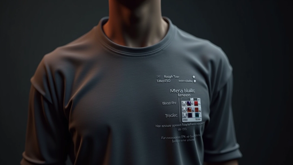
We’ll break down PBR workflows, metallic values, roughness maps, and how to combine textures for surfaces that actually look like something real.
PBR stands for physically-based rendering, and it’s the approach that makes virtual surfaces look believable. The core idea is simple: real materials follow predictable rules about how light bounces off them. We’re not making stuff up—we’re mimicking actual physics.
Instead of guessing at colors and shine values, PBR gives you specific parameters that correspond to real-world properties. You’ll work with base color, metallic values, and roughness maps. Each one controls a specific aspect of how light interacts with your surface.
The reason this matters is consistency. A metal surface behaves the same way whether it’s a doorknob or a spaceship hull. A weathered concrete wall reflects light predictably. Once you understand the fundamentals, you can build materials that’ll work across any environment without constant tweaking.
Let’s start with the three pillars of PBR in Unreal. Base color is what you’d call the albedo in other software—it’s the pure color of your material without any lighting information baked in. You want this as neutral as possible. Don’t make it darker to fake shadows or lighter to fake highlights. That’s old-school thinking and it’ll break your material in different lighting.
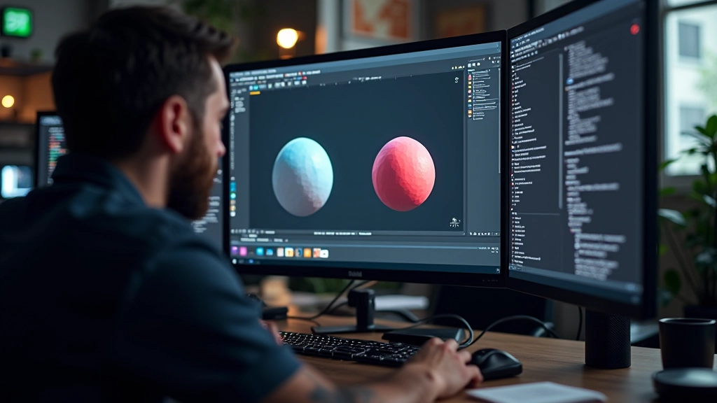
Metallic values determine whether your surface is metal or not. It’s binary in Unreal—either 0 (non-metal) or 1 (fully metal). You can use grayscale maps for surfaces that are partially metallic, like worn paint with metal underneath showing through. The metallic parameter changes how the material interprets specular reflections, so getting this right is crucial.
Roughness controls how reflective your surface is. A value of 0 means mirror-like—perfect reflections. A value of 1 means completely matte. Most real surfaces sit somewhere in between. Polished metal is around 0.1 to 0.2. Brushed metal might be 0.4 to 0.6. Concrete sits around 0.7 to 0.8. You’ll develop an intuition for these ranges pretty quickly.
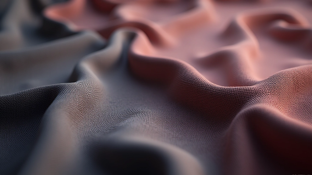
Normal maps are where materials get their surface detail. They don’t add actual geometry—they fake it by changing how light bounces across the surface. A good normal map can make a flat plane look carved, weathered, or detailed without increasing your polygon count.
When you’re creating textures, you’ll often layer multiple maps together. A rusty metal surface isn’t just one color—it’s base metal with oxidation patterns, dirt accumulation, and wear marks. In Unreal, you can blend multiple texture samples using masks and blending modes. This is where substance designer or similar tools become valuable. You’re essentially painting multiple layers of information into a single material.
The key to believable layering is variation. Real surfaces don’t have uniform color or uniform wear. You’ll want at least 3-4 different textures working together for something like weathered steel or aged wood. Each layer should contribute to the overall story—base material, weathering, dirt, and finally damage or wear patterns.
This article covers PBR workflows and material creation techniques as educational content. The methods and values discussed are based on common industry practices in Unreal Engine development. Actual results depend on your specific project requirements, lighting setup, and hardware capabilities. Always test your materials in your target environment with representative lighting conditions. For the most current information on Unreal Engine material systems, refer to the official Epic Games documentation.
Once you’re comfortable with basic PBR, there’s a whole layer of advanced techniques that push realism further. Subsurface scattering is crucial for organic materials—skin, leaves, fabric. Light doesn’t bounce off these surfaces; it travels through them. Unreal has built-in support for subsurface scattering, and it’s worth learning if you’re building characters or natural environments.
Anisotropic materials are surfaces where the reflections change depending on the direction you’re viewing from. Brushed metal, hair, fabric weave—they all exhibit anisotropy. Getting this right takes more complex material setups, but the visual payoff is worth it. Your surfaces start looking genuinely tactile instead of plastic.
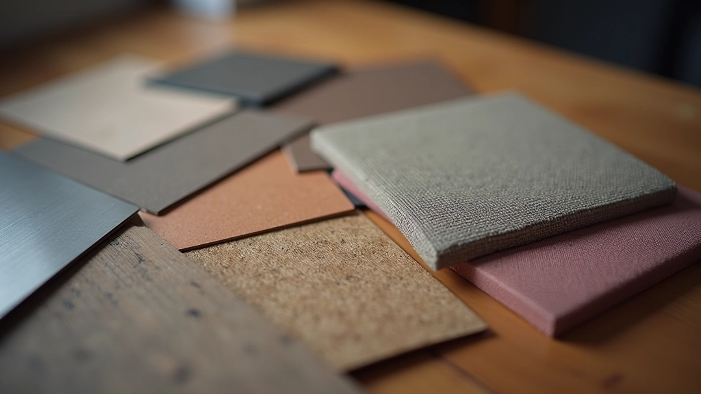
Start by finding good reference images of the real material you’re replicating. Study how light behaves on it. Take notes on roughness, metallic properties, and color variations. Don’t guess—observe.
Get your base textures from substance designer, texturing tools, or photogrammetry sources. Make sure they’re high-quality and properly mapped to 0-1 color ranges. Adjust them if needed.
Create your base setup with color, metallic, and roughness inputs. Don’t overcomplicate at first. Get the fundamentals right before adding extra layers.
View your material in different lighting scenarios. Does it look right in bright sunlight? In shadows? Under fluorescent light? Adjust until it holds up across various conditions.
Layer in wear patterns, dirt, and color variation using masks. This is what makes materials feel lived-in rather than factory-fresh.